Greenfield
Partners
Greenfield Partners came to us as a trailblazer in the real estate equity business, looking to refresh their look and feel. From rounds of exploration, they selected The Rigid Explorer. Earnest and confident, we’ll express our ability to know where and when to make moves, and tout our diligence and carefully-executed strategy as a point of pride. We leave nothing to chance, and leave no stone of opportunity unturned—and as a result we’ve unearthed more than one goldmine in our time.
Key Contributions
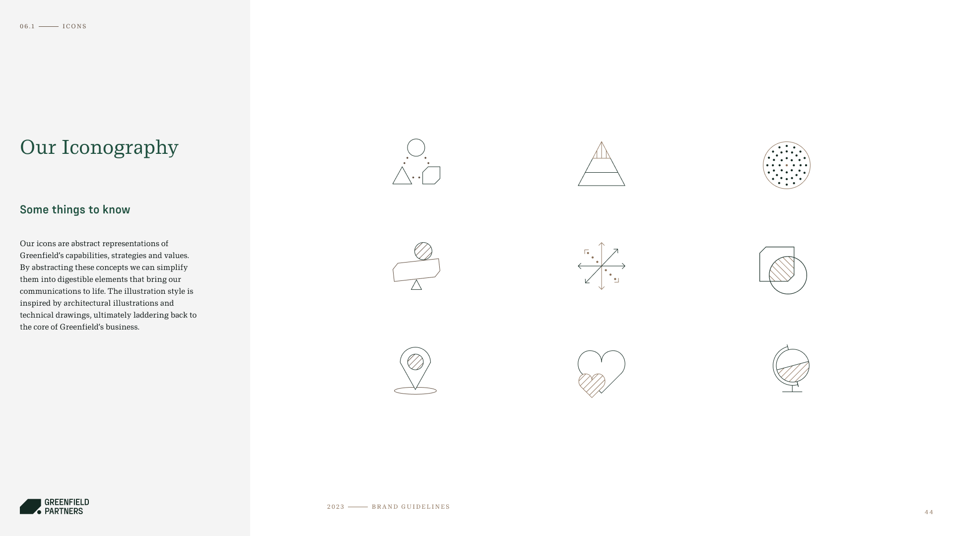
As a designer on this project, my responsibilities included exploring logo marks, selecting colors, developing a type system, and constructing the brand system for the Rigid Explorer. I crafted the selected geometric logo mark, evoking the imagery of an unturned stone. Additionally, I created custom icons to symbolize each division of their company and devised a photo treatment system reflective of the logo mark. Upon completing the system, we compiled a comprehensive brand guidelines document for the client to use as a reference for executing their brand consistently.


